After having some audience feedback, we were given some points that we needed to change about our film poster, and so I chose to edit these points.
For the names of the actors involved in the film, instead of the names, along with the actors last names, being on one line, I separated the actors' last names and their first names and then put their last names on a new line underneath. This uses up a bit more space where the top half of our poster seemed too empty. It also uses a convention of posters and more often then not, this is how their actor's names are shown if they are included on the top of the poster like this.
I then changed the review that is in the middle portion of our poster. I took out the star rating, which is something that came up in our audience feedback, as the stars crowded the review too much because the review is quite long already. I also changed the reviewer as Andrea Arnold reviewing our film has more sustenance as the film directed by her, Fish Tank, influenced us a great deal, along with the fact she is a director in the genre of our film.
I also edited the tagline of the film, I thought that it would tie in nicely if the "dying" would be in the same colour as the "Me" in our typography for the title. I tried this, however the colour got lost in the background. I then gave the text of the tagline a border, going to the 'fx' tab, once I had selected the right layer. I then used the "strokes" option, and the setting was already at 3, but I thought that the text then looked too bold, so I changed this down to 1. This helped to make the "dying" more visible.
I think that these small changes have improved our poster a lot and has made it more conventional, which is what we were aiming for.
Whilst editing our trailer, I came up with the placement of our titles, their content and their aesthetics. To aid this, I looked back on past research I had done for titles, and I also looked at the titles used in 'Fish Tank' as this is a social realist film that we have taken a lot of inspiration from and would have a similar style of titles.
For the first title that is used in the trailer, it reads "At six she wanted a barbie doll..." this suggests of the main character's, Jane's, happiness and innocence as a child. The font I chose was Lantinghei SC, which is a thin, simple sans serif font. We wanted it to be a clean, simple font to highlight the superficial aspects that is shown in the media. We also experimented in the typography in the film that I made, with blues in the text, and so I wanted to replicate this, which the blue highlights specific words to emphasise them.
The next title says "At eighteen she wanted to be one". Again, the "be" is emphasised by being a different colour to the rest. The style of the title, along with the first title is a narrative style as it accompanies the shots to give more information about the narrative of the trailer. This title shows the transition from the child at six being happy and innocent, to her now at eighteen striving for perfection, which ultimately initiates her downfall.
The next title says "From the award winning director Caitlyn Watson", which is a convention in trailers to show the name of the director of the film. Especially if the trailer has a low budget, the past works of the director could bring in fans and the audience for this new film.
For the next trailer, it reads "A girl's internal struggle", which has gone back to the narrative style of the first two titles. It gives a description of the film and tells the audience what they are in for in terms of content in the film, showing that the film is about the character's struggle, without explicitly saying that it is a struggle with an eating disorder, this information is left for the shots.
This title reads "Introducing Best Newcomer Ellie Bartram". This is similar to a title that we saw in the Fish Tank trailer. Because the actor of Katie Jarvis was relatively unknown and wasn't even an actor before the film of Fish Tank, this introduces her into the film and shows that she is something new and exciting.
This is the end title screen for our film, it includes the typography that I created earlier for the film. I had to edit the typography to have a white border around it as we wanted a black background for the titles, the black of the "Eating" and "Up" was before, lost in the background. I also added the Cannes film festival logo at the bottom to imitate that the film would have been shown at the film festival as it is a prestigious film festival, especially for indie films.
We then included an ending title after the title showing the typography which reads "Coming Soon", to reinforce that this is a teaser trailer because it hasn't given a release date as yet. This title page also includes the billings block, which is conventional of trailers.
Cyberbully (2015) follows the life of the main character, Casey, who is subjected to cyberbullying by an anonymous user. She is trying to protect her identity while the anonymous user blackmails her with leaking images and information about her. Unlike most bullying films, which are normally shown in a social realist genre, this film is a thriller and shows the danger of the internet.
We used the plot of the trailer for the film to inspire our own trailer's concept. We knew that we wanted to show how trolling (which is used to represent society) can affect people online and so we wanted to look at different films or trailers that incorporates the idea of bullying and the internet, with social media to see how they portray this. During the trailer for Cyberbully, the antagonist, the anonymous user is only shown to be on the computer, the audience do not see the face of the character at all, which unnerves the audience as well as the characters. The only interaction shown between Casey and the anonymous user, is him talking through speech modification software, this creates more fear as the voice sounds somewhat off to what is expected, which is explored by the 'uncanny valley' theory. The 'uncanny valley' theory is mostly used for aesthetics, however it could be related to the idea of using speech modification software used in the trailer. It is the idea that things that look too near human, like advanced robots, but still have something not quite human about them, it scares humans because there is something that isn't quite right about them. Throughout the trailer, the voice of the anonymous user says things like "you think you are the victim? you're not the victim, Casey". These are comments that are typically used by cyber bullies or thoughts from the victims. I think that the horrific way that cyberbullying is portrayed in this is very interesting, and is something that inspired us in a way to go down the route an eating disorder in our trailer, along with the disturbing images seen in the website background and poster. However, because we wanted to create a social realist film, we wanted to show cyberbullying realistically, rather then in this film how it is emphasised to give a horrific effect.
We have looked at lots of different films for to inspire our trailer in the past, and this is one of them. Cyberbully (2011) is a TV film that follows the ordeal of a teenage girl who falls victim to bullying online through a social networking site. The main character, Taylor, is given a laptop for her 17th birthday and is excited for the freedom that this would bring her. However, she finds herself the victim of a cyber bully attack which pushes her into attempting suicide.
Cyberbully (2011)
Because we have decided that we want our film to show the idea of body shaming and body image through social media, this film had been very helpful to us in thinking about how we could portray things, and giving us ideas how to show a attempt on suicide scene. However, we later thought that this type of ending for a teaser trailer was too final and went with the idea of showing our character, Jane, at a clinic instead.
attempting suicide scene in Cyberbully (2011)
From the scene starting at 3:29-4:58, the scene begins with her friend running to Taylor's house as she has just seen a video that Taylor had posted suggesting that she is going to commit suicide.
She finds her room empty, and searches the house until she find Taylor in the bathroom.
(EDITING TECHNIQUE) shows Taylor's family running up to the bathroom to find them both
Close up shots of their arms show Taylor and her friend fighting each other to take the pills away.
Close up shot shows that the pills have fallen on the floor
A two shot/ reaction shot shows Taylor screaming that they have fallen to the floor as now, she cannot take them, and her plan has failed.
A shot reverse shot is used to show Taylor crying in her mother's arms and to show a reaction shot of her brother looking panicked and helpless.
There was quite a lot of time given in the film for the whole scene of Taylor's suicide attempt, to portray it in the right way. Because of this, along with the scene being too resolved, we decided that in a teaser trailer we would not have enough time to portray this scene in the most sensitive way, and so changed the idea of our trailer ending to that of in a clinic. However, the whole film has been helpful to our trailer as it has helped us with the theme of social networking a cyberbullying.
After getting the audience of our film to assess our website, we were given some corrections that we could make so, for them, it would be more conventional and what they want to see in a website for a new film, as part of a promotional package.
First of all, the boxes at the bottom of the website were too big, and they didn't seem conventional for a film website. So, to correct this, I took out the boxes, but kept the text, then added arrows next to the text. I then linked these arrows with the Blog and Charities pages so these could act as buttons.
We were also told that on a different computer, the social networking icons weren't visible, so to correct this, I moved the typography and the menu down so then I could put the these social networking links at the very top of the page.
We were then told that the boxes on the right hand side, including the Cannes film festival and our production companies were not conventional. To change this, I deleted the boxes and then made the three images black and white and deleted the background. I then moved these to be near the other parts of the text. Editing them to be black and white made them merge in more with the website's theme and they didn't stand out too much.
I was also told that the reviews were too big and so were the reviews' stars as they took up too much space for the website when seen on a different computer. Because of this, I made these smaller and moved them closer together. This also made it look like there was a lot less writing then there was because the text is very small.
For the website, included in our promotional package for the film, I designed the layout. For this, I have used the website Wix, an online website builder.
For our menu, I added "Home","Behind The Scenes", "Blog" and "Charities". From research into other film websites, we have seen different types of 'Behind the Scenes' pages and thought that it would be a good addition to our website because our trailer would have a niche audience, and a very low budget therefore not a commercial film, it would allow the audience to identify with the characters more and would be a chance, to get to know them. The Blog page, I thought, is also an important addition to our website because our film highlights on social and moral issues, it would give a chance for our audience to debate and discuss different issues that could be brought up in our film, or different issues that the audience wish to discuss with other like-minded people. It gives the audience a chance to interact with another giving them a shared experience. Also the charities is something that I have seen on very few websites, however I thought that it was important to add in because our trailer highlights some harsh issues that our audience may be able to relate to in their lives, so the website would include different charities like ChildLine to allow our audience to seek help with their own problems, like Eating Disorders, which plays a prominent part in our trailer.
I have included the same typography that we have used in our trailer and poster to make sure that we have consistency flowing through our whole promotional campaign. Throughout the website also, I have kept to the same colours as the typography as these colours are a theme shown throughout our promotional campaign. I also linked the typography with the home page, so when the audience is on a different page like the 'Blog' page, the title acts as a link back to the home page also.
After researching, Georgie gave me different reviews that are conventional of film websites, so I typed these into our website and changed the colours of them to fit our colour pattern. I also added the star ratings, which is also something that we found conventional of film reviews.
Here, I added production company stills and the logo from the Cannes Film Festival. This is something that I have seen in past students work and so thought I should add this in as it promotes the production companies that have 'produced' our film.
I have embedded the trailer into our website so the audience of the website can see what the film is about straight away, and it also makes our trailer more accessible.
Here, I have added extra buttons to pages and I have linked them up to the appropriate pages, this gives more of a description for the Blog and the Charities pages and also acts as a link also.
I have also added links to different social media accounts. The social media account links are important to include because it widens our audience and also because our film wouldn't have been a commercial film as it is a social realist, and so typically would have a lower budget, it would advertise our film through social media. It is also important to add these links as social media is an important part of our film concept as it is to do with trolling, and Pinterest and Facebook have been included in our trailer alone.
I will be researching into different sound clips that could be an appropriate inspiration for the sound in our trailer. I have found 4 sound clips, 2 from a video game soundtrack, called Life is Strange and one from the film Captain America the Winter Soldier.
Mountains by Message to Bears from the Life is Strange Soundtrack.
Using the section 0:00-1:10
This piece starts with strings with slow, light strings that is accompanied by a base to make parts of the strings stronger.
A soft drum beat then introduced to make the parts with the base a lot stronger and carries the beat of the piece.
The strings then change gradually and the tune changes, while the tempo increases, however the tempo is still quite slow.
The tempo throughout the section is very calming, and can represent sadness. It also is quite 'raw', this would be a really good fit for our trailer, and we could take a lot from this, like the slow tempo for some parts of our trailer, and the use of strings.
Max and Chloe by Jonathan Morali from the Life is Strange Soundtrack
Using the section 0:00-1:20
Soft and calming atmospheric sounds are played at the beginning of the piece.
An acoustic guitar is then played with an incredibly slow tempo
The atmospheric sounds are then layered over the top of the guitar sounds
A soft drum is then used to carry the beat while the guitar changes the tune and tempo.
Again, in this piece, the tempo is very calming, but this could also represent sadness. This slow tempo could fit the beginning of our trailer really well, while we might need a piece with a faster tempo near the end of our trailer to represent our character's uncontrollable life.
Using the section 0:00-0:30
This section starts with atmospheric, organ sounds which builds momentum throughout the piece.
Strings are then introduced that have quite a fast tempo, which creates a sense of anticipation.
The music could fit for our piece, however the fast tempo may work better for the disequilibrium part of our trailer, as this the fast tempo creates a sense of anticipation rather then calm or sadness.
I think that these three examples would work really well in different parts of our trailer. All three of these pieces use different types of strings and a variety of tempo's which could be something that we look into for our music.
After having some of our new footage reshot, I edited this into our film.
For the POV shot of the character looking at her plate of food and not really eating anything, we thought that the shot that we had before was too dark and was overall, not as good quality as we wanted for our film. Because of this, we decided to reshoot this shot. Once I was given the footage, I added it into the timeline where I thought that it would work well most in our film, and then cut the best section from the footage. I then deleted the rest so we were left with the best parts, this was because some of the footage was shaky and so I used the part where the camera was most static.
I then detached the audio from the clip and deleted it. This is because we didn't want the audio from the shot to be heard because we just want the non diegetic music to be heard, that would be created by our group member Ellie.
I then added another screenshot of Pinterest before the scene of the character grabbing her stomach, which would show directly how the media is manipulating her to feel bad about her body image. I then added the transition cross dissolve on either side of the Pinterest screenshot as it then it would fade in and out so to show this is what the character is remembering when she looks at herself and it makes the transition a lot less abrupt, rather then a cut.
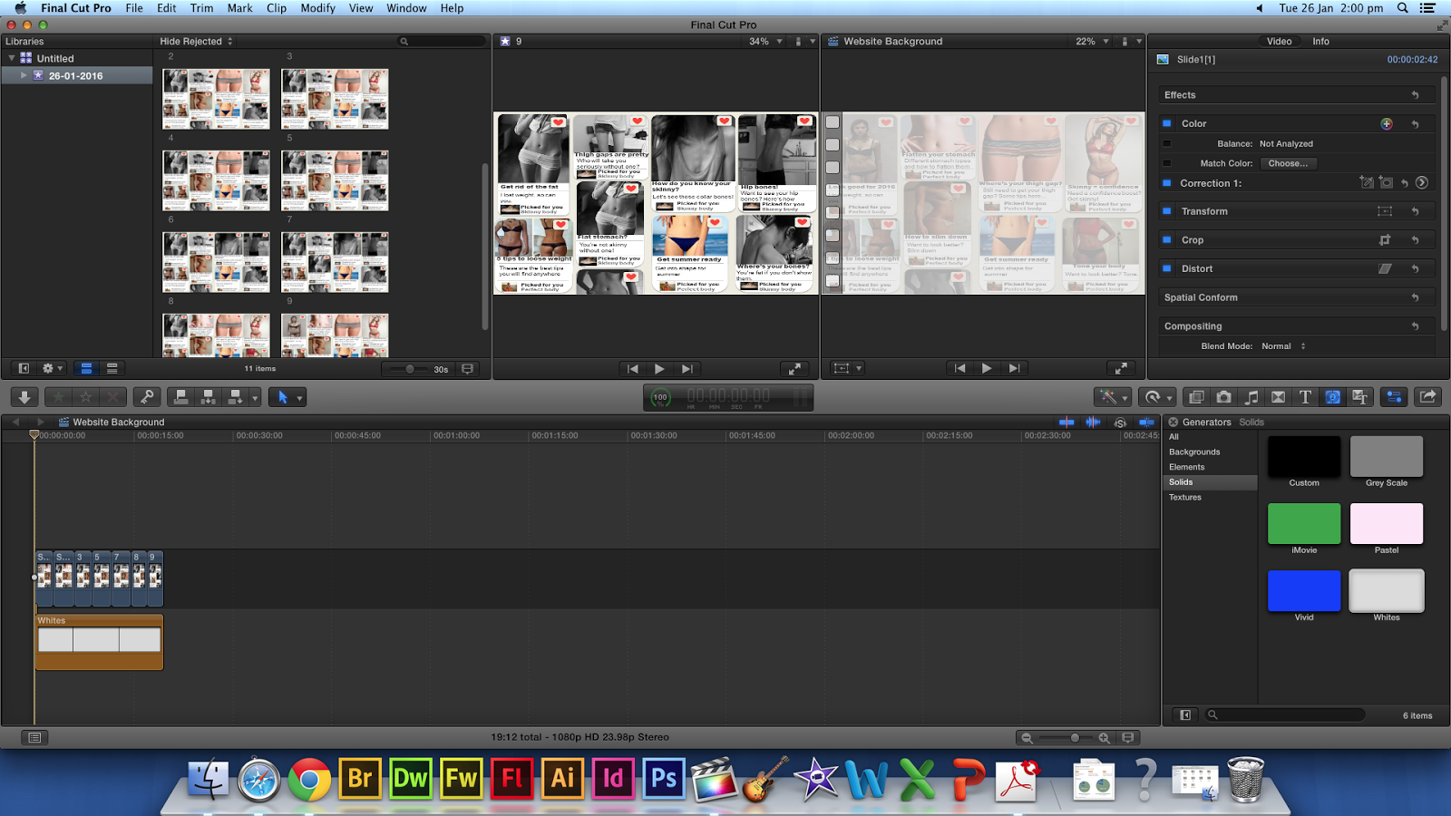
After creating the website background, I realised that there might be a problem with the background as there is writing for the comments of the pictures, like what you see on Pinterest, but because this is a background, it could detract attention from the writing that would be on our website main body. Because of this, I edited the background further to then make it more transparent.
Here, I played around with the opacity settings of each of the JPEG's in Final Cut Pro and changed these settings from 100% to around 40%, however, because the default background for Final Cut Pro is black, this just made it even darker.
I then found a white background in Final Cut Pro and then added this on top of the JPEG's I had, this then gave the desired effect and made the background seem more transparent.
However, after continually watching the background, I thought that the images change too abruptly with just a simple cut, because of this, I added the Cross Dissolve transition on each cut, and now the editing is a lot smoother.
Here is the finished draft:
However, when uploading this into Wix, the footage was too big, at around 200MB over the limit, so I tried to compress the footage on a free compressing website.
But, this made the footage too low quality for what I was happy to use for the website. I tried all the different settings that I could, to see if one would work that I would be happy with, however, each time I tried the footage was either still too big, or bad quality. I then went back to the images in Powerpoint and changed the opacity on the slides then I saved them all as a JPEG again and started from scratch in Final Cut. I made each image on the timeline a lot short, as after exploring Wix more I found that you could slow the background footage down after uploading. I then didn't use any transitions, unlike before, as this added more MB's to my footage. I then uploaded this to Wix, and it worked without compressing so the footage was of the quality that I was happy with.
I am going to deconstruct the official trailer for the social realist film 'Fish Tank', which would give us an insight to what is used in a social realist film trailer to cross examine the conventions with our own trailer, and more specifically how the music is used during the trailer.
0:03-0:04 shows an establishing shot of the council estate where the film is set and shows a mid shot of the character at the block of flats, again to show that the character is situated there. A beginning establishing shot is also something that is used in the 'London to Brighton' trailer, which is something that we should look into as a convention.
0:05-0:19 shows a close up of the character, Mia, getting ready and doing her makeup, which represents her as a typical teenager of today. It then continues to a mid shot of her walking down the stairs but her sister is shouting while her mother is pushing her out of the kitchen, which is suggesting her mother's 'heavy-handed' approach to her children. However, the music doesn't change from its street type strings and drums, which shows that this is a regular occurrence. This is something that we can take for our trailer, to keep the music the same even when some of the shots may be disturbing, or out of the 'norm' to show that its a regular occurrence and the characters are desensitised to it.
0:10-0:11 shows a title showing that it is a Cannes Film Festival winner and so validates that this is a good film, because of the awards it has won.
0:12-0:15 shows another title showing more awards won and nominations for awards including awards won by the director and by the actor.
0:18-0:25 mid shots and close up shots, using a handheld camera shows Mia's attitude towards others, that she isn't like regular teenagers her age and is trying to pick fights with other girls. The handheld camera positions the audience with the character and gives the film a documentary style like its factual and the audience are actually there with her.
0:26-0:27 another title saying "All her life", the music has changed to more of a slow piano style to highlight the character's vulnerability, rather then just her antagonising attitude.
0:30-0:34 the piano style music is continued, while shots are shown of her mum shouting at her and pushing the character around. The music plays an important part in this, as it makes the audience feel empathy with the character, while if the music that was there before had been playing during this part, it would desensitise the shots and the audience may not find her mum pushing her around as much of a big of a deal then with the shots showing with the slow piano music.
0:57-1:06 the slow piano style, which has connotations of sadness and loneliness, changes to a more upbeat piece of music when the character of Connor is introduced which replicates Mia's feelings for him.
1:07-1:54 The music then changes to mainly strings again with also drums, to show Mia's life spiralling out of control as fast paced shots continue of her mum pinching her and Connor slapping her, as these fast paced shots continue, the music starts to pick up pace as well.
In conclusion, this shows that strings are an important part of music in a social realist film, also the lack of change in music can show that shocking images are normal for the characters.
For our website background, we wanted it to show different images of the perfect body that our character would aspire to look like. We wanted the background to also change the images into more distressing images like people who are too skinny, to show the character's journey into becoming obsessed with being skinny.
We thought that it would be better for the images to appear on a social media, like Pinterest as this would incorporate the idea of body shaming across the internet, like how the character is bullied on Facebook in our trailer. However, I didn't want us to just print screen Pinterest, so I created pages to look similar to Pinterest.
For this, I edited the pages on different slides of Powerpoint, this is because its a simple program to use, and I knew that it had all the tools I needed to make it work.
I made the background an off white colour to mimic Pinterest's background. I then added different sizes of the squares with rounded edges and then softened the edges to make it look more like Pinterest. I then started to add different images of 'perfect' bodies from the internet and added a white box at the bottom for room to write descriptions of images and headings for entries like Pinterest, for example "5 easy tips to slim down".
Once I had added all the images in, I then added comments about them and created the heart button that is seen on Pinterest.
This is one of the finished slides, I added different pictures of people's perception of beauty to a somewhat extreme extent, like bones showing through skin. With the images that are extreme I have changed the comments and who they have been posted by, to show that the character's idea of the perfect body has changed and that she feels this is her inspiration.
I have saved the slides, each time I have changed one of the boxes from the 'Perfect body' to the 'Skinny body' images, and I have saved them as a JPEG. I then imported all of these JPEG's into Final Cut Pro.
I then put in each of the images in order to make sure that the video would continue properly for the desired effect.
After cropping the images' duration, the page continues to change from more 'comfortable' body image representations to more extreme representations, showing the characters change of aspiration.
In conclusion, the background works really well, the only problem would be that if this is chosen by the rest of the group to be the background of our website, the writing of the comments from the background could distract from the writing that would be on the website. This could be fixed by making the background more transparent and is something that we would have to look into, whether we can do this on Final Cut Pro, or our website design site that we are using, Wix.
After creating the first draft of our trailer, we decided that we needed more shots from social media accounts to show the link between the problem of the media and our character's struggle about her body image. Because of this, we thought that it was necessary to add more shots from Pinterest, rather then just comments from Facebook. This is what I will be completing. The shots that we wanted are; a shot of scrolling down a page on Pinterest that shows images of 'skinny' people as this is society's perception of beauty then we wanted some static screenshots to use throughout the ending of our trailer, when the editing becomes fast paced to show exactly how these images are affecting our character.
Who will be attending?
Caitlyn Watson
What will we need?
Laptop
Pinterest account
LoiLo Game Recorder
Evaluation:
This piece of filming went really well, I was able to get all of the necessary shots for this. However, the screen capture software doesn't seem to be very good quality, even though it is easy to use, as the footage that came from it seems to be not focused properly, but the footage is still usable.
I am going to deconstruct the trailer for 'This Is England' for more ideas about editing. This film also falls within the social realist genre, the same genre that our trailer is in, and so it would be helpful to get more ideas on how to edit our film in different ways, that we wouldn't have otherwise thought of.
0:01-0:06 shows a montage of different clips that people would relate to as being in the 1980's. This is used much like an establishing shot, as the montage of clips establishes the audience to what decade the film is set in. Although this is an interesting idea, I don't think that we could use it in our film because the decade that our film is set in, has no real significance to the plot.
0:17-0:20 In between shots that are in colour, there is a montage of black and white images of the characters, one of which shows the young boy seen in previous shots, with a woman at a shoe shop. The hairstyle of the woman is a typical 80's style which again places the audience in the time of the 80s. The images embedded in between the moving image shots change with the beat to the sound playing throughout the trailer, which gives the shots more significance within the piece.
0:42-0:45 starts with a review screen, with the voice over of one of the characters speaking from the film. When the character continues to speak about Thatcher, a clip of Thatcher on a bus is played and then the clip changes to the character that is speaking. This is an interesting concept, buy using speech from a character that would be diegetic, in a non-diegetic way to act as a voice over while other clips are playing. This entwines the review screens with the clips of the film so the review screens doesn't stagger the trailer too much.
1:26-1:59 After a cut to black, the shots that come after this, the diegetic sounds have been deleted and instead plays a non-diegetic soundtrack of slow strings. The slow strings has connotations of sadness, however, some of the shots used have quite a happy mood so the soundtrack choice could have been for irony but it could also suggest that the characters show that they are happy while there are bigger social issues going on in this time period.
Throughout the whole trailer, it seems that it has been edited with continuity as it shows the young boy making friends with the older group of men and then their friendships developing. This makes the trailer seem like it is a very shortened version of the film, as in the timing of events.
I am going to deconstruct the trailer for 'London to Brighton' to see what is used within the trailer, for research for our own teaser trailer. Because this film is a social realist trailer like our own trailer, it is useful to find conventions within the 'London to Brighton' trailer to for us to use in our own trailer.
0:03-0:05 is an establishing shot of London to show where the narrative begins
0:05-0:10 is a mid shot of the young female character, Joanne, on her own on the streets of London, which turns into a long shot to show people walking past her with her asking for change, which shows her vulnerability.
The sound also overlaps these shots from the next shot at 0:11-0:14, showing Joanne and an older woman, Kelly, smoking and seeing how old Joanne is.
0:14-0:16 a review from the Times "Blistering raw, utterly compelling drama" which confirms to the audience that this is a good film and the review has come from a reliable source.
0:16-0:27 shots of Joanne and Derrick, Derrick asking Joanne if she wants money, she has to go and see someone for him. Showing that he is turning her into a prostitute. She is wearing a hoodie that covers herself up, showing that she isn't sexualising herself and showing her innocence but has a cigarette behind her ear which subverts the idea of her being innocent.
0:27-0:29 Another film review, from Film Review, "Brutally raw thriller, with sharp serrated edges".
0:29-0:31 Showing Joanne being driven in a car to meet the 'client', with her having makeup on, which sexualises her.
0:31-0:34 Mid shots showing all of the shops being shut down, showing that London is run down and the lack of social mobility there is in London.
0:45-0:47 The 'client' an older man, takes Joanne's hand and walks off with her in his extravagant house.
Speech from later on in the film is overlapped with footage from the beginning of the film, used to tell the narrative without needing titles.
0:57-0:59 Another film review from, Big Issue, "The best british film of the century".
1:00-1:09 The first scenes of the film are shown with Joanne crying and Kelly has a black eye, with Kelly trying to rub the make up off Joanne.
1:21-1:23 Another film review from The Scotsman "Reminds you just how good British cinema can be"
1:23-1:29 Shows the ending scenes of the film with Kelly crying and Stuart holding a shotgun.
1:29-1:32 Another film review from The Guardian "Audacious, exciting film making. A dazzling debut"
Then the trailer ends at the title.
Conclusion: From this, I have come to understand that film reviews are very important within social realist films, as researched before, they are generally given a smaller budget and so had a lot less advertising and hire unknown actors. Film reviews from credible sources tell the audience that this is a good film and one that they should see. It also has told me that the shots in the trailer, do not have to be placed in chronological order of them appearing in the film, the narrative is still clear in doing so.
After a photo shoot to get some photos for our poster, I used one of the
photos to get used to Photoshop and figure out how we could edit the photos for
a poster idea the we had come up with.
Firstly, I chose the
photo that was the best quality in terms of focus and also the one that was
best positioned for how we wanted the poster to look. I started by opening this
photo on photoshop, and adjusted the colours and brightness to make it a better
quality. I then duplicated the layer so I could separate the background and the
character as I would be editing them separately. I then used the magic wand tool to select just the character in the model, I then inverted the selection and deleted the background.
After deleting the background in one of the layers, I selected the layer that still had the background on it. I then experimented with the transparency of the layer with the background on it. This then made the background transparent but kept the character in tact.
This could be used for a draft of our poster at a later point, however this was for an experimental task and a chance to learn the different tools on photoshop.
After researching different typographies to use for our own film, I have created different typographies for our film, and then as a group we have decided which one is best. These typographies all look similar, however all have subtle differences. As a group, we have decided on a brief for our typography:
The typography should have a realistic hand writing feel
The typography should have different colours, preferably black and blue.
Should experiment with the sizing of individual letters.
To make these typographies, I used the program Paint Tool Sai, and used my digital art Bamboo tablet. I used the stabiliser S-2, as I tried S-7 however because this was very restrictive, it didn't allow me to write the typography and make it actually look freehand handwritten.
Idea 1:
For my first attempt, I used the pen tool at thickness 12, and experimented with the sizing of the letters.
We wanted to experiment with the sizing of letters, because the discontinuity of the letters reflects the character's own breakdown and imperfections.
I also used a blue colour for the 'ME' which highlights the word and makes the title much more personal to the character and therefore more relatable to the audience.
Idea 2:
For this typography, I kept with the same pen and thickness.
I changed the colour order of the words, the 'ME' is still highlighted because of the other two words are in a different colour, however, I felt that this didn't have as much of an impact as when the 'ME' is alone blue.
I also changed how the individual letters are sized and exaggerated the 'E' in 'EATING'.
Idea 3:
For this typography, I used a different tool, the brush tool, still at the thickness 12. The brush tool gives much more rounded edges and has less of a texture in the writing. The brush tool, I think wouldn't be the best tool to use because it has a less realistic feel of being hand written.
Idea 4:
Because of the disadvantages of the brush tool, I went back to experimenting with the pen tool.
I changed the thickness to 20, as I thought the typography may have issues on the website and poster of being visible, and it is vital to have the same typography throughout the film, poster and website.
I made the sizing of the letters more equal, in that they finish at the same point at the bottom, like it is written on a straight line.
Idea 5:
For this typography, I kept to the pen tool and to the thickness of 20.
I made the sizing of the letters much more unequal and obvious that they are unequal and purposeful.
I kept the 'ME' as blue because this is the colour that the group decided, after reviewing my ideas, that they liked for it.
After discussing with the group, this is the typography that we have decided to go for in our film because of the positives of each idea, being brought together in this typography idea.
After filming the final scene of our trailer on our first filming day, we decided that the footage wasn't good enough to use and the general idea was too final for a teaser trailer. We have decided to re film this final scene and decided to change, the main character, Jane, would be shown in a clinic feeling nervous and look in a bad way. this would make it less final and more of the beginning to her recovery.
Who will be attending?
Ellie (actor), Caitlyn (filming) and Georgie (costumes).
Where will we be filming?
At school, Wellbeing Room.
Pros and Cons of the location?
Pros: It is a room for healthcare and so there are lots of healthcare posters and it looks realistic. Cons:If someone is taken ill in the school, we would have to cancel our filming session.
What shots will we take?
Extreme close ups of Jane picking at her jumper, looking uncomfortable, eyes with mascara smudged. Shots long shot or medium shot of her showing her alone.
How long would it take?
We are giving the timing of this filming session an hour, 1:20-2:20, during lunchtime at school.
As part of my research, I thought that it was important to recap on camera angles and specifically the camera angles that we wish to use and what effect these have.
This is a long shot, this allows the audience to see the whole body of the character. If the subject is alone in the shot, this could show vulnerability as it emphasises the isolation of the character. A long shot can also be at the beginning of a film, trailer or tv show of a building, which shows a place or building. This is also known as an establishing shot. These establishing shots normally have a static camera, as a movement would make the audience remember that they are watching a movie, while the point of an establishing shot is for believably.
A high angle shot is used to show vulnerability to the character. It shows the audience literally looking down on them, which gives the audience a feeling of power over the character and makes the character look a lot smaller. This not only shows the dominance that the audience has over the character, but also the dominance other characters have over the character, when these types of shots are used in a shot reverse shot.
This is a low angle shot. The camera is positioned below the character, which makes the character look taller. It also positions the audience below the character, making them feel vulnerable and at a lower status then the character. It also doesn't just place the audience, but it also shows the hierarchy in the relationship between characters also, shown through editing like shot reverse shots.
This is an over the shoulder shot, as it literally shows a shot that is over a character's shoulder. This could show a conversation between two characters, or more. It could also show the reactions characters have to one another. During a conversation it these shots are generally edited as shot reverse shots to show each of the character's faces during the conversation.
This is a profile shot, where you only see on side of the body of the character. This evokes some sort of mystery within the character as you don't get to see all of the character, and therefore reflects that you don't get to see all of the character's personality.
In conclusion, this piece of research has been very useful. Although I haven't looked at all of the shots that could be used within a film, it has allowed me to recap the basic and most important shots that we would need to use in our film and what these shots evoke.