Blog Archive

Showing posts with label Editing. Show all posts

Monday, 8 February 2016

Creating titles

Whilst editing our trailer, I came up with the placement of our titles, their content and their aesthetics. To aid this, I looked back on past research I had done for titles, and I also looked at the titles used in 'Fish Tank' as this is a social realist film that we have taken a lot of inspiration from and would have a similar style of titles. 


For the first title that is used in the trailer, it reads "At six she wanted a barbie doll..." this suggests of the main character's, Jane's, happiness and innocence as a child. The font I chose was Lantinghei SC, which is a thin, simple sans serif font. We wanted it to be a clean, simple font to highlight the superficial aspects that is shown in the media. We also experimented in the typography in the film that I made, with blues in the text, and so I wanted to replicate this, which the blue highlights specific words to emphasise them. 

The next title says "At eighteen she wanted to be one". Again, the "be" is emphasised by being a different colour to the rest. The style of the title, along with the first title is a narrative style as it accompanies the shots to give more information about the narrative of the trailer. This title shows the transition from the child at six being happy and innocent, to her now at eighteen striving for perfection, which ultimately initiates her downfall. 


The next title says "From the award winning director Caitlyn Watson", which is a convention in trailers to show the name of the director of the film. Especially if the trailer has a low budget, the past works of the director could bring in fans and the audience for this new film. 


For the next trailer, it reads "A girl's internal struggle", which has gone back to the narrative style of the first two titles. It gives a description of the film and tells the audience what they are in for in terms of content in the film, showing that the film is about the character's struggle, without explicitly saying that it is a struggle with an eating disorder, this information is left for the shots. 


This title reads "Introducing Best Newcomer Ellie Bartram". This is similar to a title that we saw in the Fish Tank trailer. Because the actor of Katie Jarvis was relatively unknown and wasn't even an actor before the film of Fish Tank, this introduces her into the film and shows that she is something new and exciting. 


This is the end title screen for our film, it includes the typography that I created earlier for the film. I had to edit the typography to have a white border around it as we wanted a black background for the titles, the black of the "Eating" and "Up" was before, lost in the background. I also added the Cannes film festival logo at the bottom to imitate that the film would have been shown at the film festival as it is a prestigious film festival, especially for indie films. 


We then included an ending title after the title showing the typography which reads "Coming Soon", to reinforce that this is a teaser trailer because it hasn't given a release date as yet. This title page also includes the billings block, which is conventional of trailers. 


Sunday, 7 February 2016

Re-editing Film Poster

Audience feedback that we received revealed that the positioning of the text at the top of our poster was not conventional, and was a little difficult to read as it seemed random.
Therefore, I have decided to look at social realist film posters in order to discover where this information should be placed.

The first poster I looked at was the one for Shank. This has a central title, with the name of the actors placed just above, the director mention placed next to the title, and the tagline placed at the top of the screen. However, audience feedback implied that the positioning of our tagline - just below the title - was effective

I began my reedit on Photoshop by moving the name of the actors to the top of the poster, as I found that this was conventional of social realist films, as demonstrated below.


In order to do this, I had to select the T icon, which then allowed me to move the text onto one line, with spaces in the middle, and manipulate it to fit at the top of the page while being centralised.
After this, I edited the positioning of the text which stated "A Film by Caitlyn Watson". 
I began by selecting the lasso tool, found in the top left corner, second icon down. This then allowed me to create a box around the text I wanted to manipulate. 


After this, I selected the layer on which this text lies - titled after the text itself, and right clicked to choose 'transform selection'. This then meant that I could choose the first icon in the top left corner, allowing me to move the text.


The initial position I attempted was top and centre, just under the actors names, and staying on two levels. However, this looked clunky, and made it seem as though the director mention was the key part of the poster.


Hence, I moved the text onto one line, and placed it just above the title, while moving the tag line to lie just below the title towards the right, taking inspiration from the poster shown below. This made this section of the poster seem clunky and left a large empty space at the top.


Thus, I moved the text again, keeping it on a single line, but placing it centrally below the actors names, and moved the tag line back to its original position. This used up more of the space, but still left a rather large gap at the top, and so it is likely that we will go back as a group and see what we can change so as to fix this.

Evaluation
Although this re-editing of the poster did improve the overall layout, and we decided as a group that we preferred to have the actor names spread out across the top, we were still unsure on the positioning of the director mention. Therefore, Caitlyn will look at the poster to see if we can eliminate the empty space between the text at the top and the title.

Saturday, 6 February 2016

Poster Creation

Following our photoshoot on the 12th December for our poster and website we now had an image suitable for our poster, which we edited using Photoshop. 
Original Photo

Opening the original photo I cut around myself and the grass, then inverted this

I then tried to lessen the opaque on the wall. This didn't noticeably work and I was unsure of how to fix this until a friend with more experience on this software explained to me that if I copied the background then deleted the original background then I could separate the two parts of the image. I did this and was able to split the two sections of poster into different layers. I opaqued the wall to 50%.
Wall With Person On Separate Layer

Following this I inserted the previously saved title of 'Eating Me Up' by opening it as a separate file and dragging it to the file the poster was on. I then resized it and placed it half way down the poster, a convention in social realism films and supporting the golden rule.

Insertion of Title
The tagline we came up with was 'She's dying to be skinny', with the word 'dying' in italics to emphasise it. One problem we came to with this was that the typography this was in should match with what was used on our website. However the typography we currently had on our webpage was not available on photoshop as it was a Google font. This meant we had to find a font that was available both on Wix and Photoshop, but also fitted our genre. We settled on Courier New. I typed our tag line on and inserted it below the title in a size 12 font. 

Adding Tag-line
Following this I used the same font to add in the reviews to the right of the crouched girl. This reads 'Powerful and moving, this tackles the prominent issues of society in a beautiful way'. The words that we decided were the most important are 'powerful', 'moving' and 'beautiful', and we made these two sizes larger in font that the others. I also added 5 stars and 'The Guardian' below this, as this is commonly seen in social realism posters.
Added Review and Directors Credit
I also inserted the actors names at the top of the poster and 'Directed by Caitlyn Watson', as, again this is a common convention. 

Caitlyn made us a Pinterest styled background as is used in the website for the background to go over the wall. I added a layer at the bottom of our layers and inserted this. It was black and white, however it was originally very dark in colour and our writing was hard to read. I overcame this problem by increasing the brightness on the right hand panel, leading to the images all being visible and the text to be able to remain the same. 

With Pinterest Style Background
Finally I inserted the billings block in the grass which Stacey has made for us.


Final Poster


Thursday, 4 February 2016

Inserting reshoots to trailer

Having done our reshoots we now had to insert them, but we also had to make sure the length of these was the same as the ones previously used, as the sound had been created and inserted, meaning any difference would affect the accuracy of sound.

The first clip we did was the balloon scene with the 18 year old girl. I originally found a section of the footage from the new that we liked, and having selected this I then cropped it directly above the pre-existing footage. 

Despite believing that this would be the way to do it quickly, I then swapped the footage out and re-watched this section of the trailer and realised that this section was now very short and sandwiched between two pieces of the old footage. 

I undid all the changes I had made and dragged the old clip up. Doing this I realised the mistake that I had made was that the two effects on either side were covering some of the footage, so it was longer than I originally thought. 

To solve this problem I dragged the old footage up again and made a note of where it began, and dragged the new footage beginning to there, then copied the process again but for the end of the new footage.

Swapping in and out the new footage having done this change in approach led to the footage being cropped in the right place and being the same length as required. I did the same process for inserting the scales scene further on in the trailer.

Wednesday, 3 February 2016

Adding sound to trailer

Having emailed myself the finished sound clips I added them to our trailer in Final Cut Pro. I had emailed myself a copy of the main soundtrack with voices already on it, and one with them to insert separately. As a group we decided that it was best to use the two individual files.


Inserting the main soundtrack was relatively simple. Simply dragging the imported clip to the beginning of our trailer, then watching it over to make sure that it did all match up with what was happening on screen. Luckily it did, so I was able to insert the voice clip.
Inserting main soundtrack


This proved to need a little more care, as finding the exact place we wanted it to start so that it didn't start too abruptly, but also end within the recorded clip. We did this by zooming right in on the timeline and listening several times when we adjusted it.
Inserting voiceover

the final thing to do was fade the end of the clip so it didn't suddenly end when the titles were on. We did this by dragging the adjustment toggle on the end of the audio section on the trailer's timeline.
Fading the end of the music

Having completed this we were able to upload the trailer as a draft to Youtube.

Excited for music to now be on our trailer we watched the trailer from Youtube (we had already listened multiple times from Final Cut to make sure it was appropriate and edited correctly), however when the two pedal synthesiser notes started there was a weird demonic effect to them. Confused, we re uploaded the trailer to Youtube and listened again. The effect was still happening and this time we also realised it was also affecting the voiceover.


Going back to Final Cut I discovered that the decibel level on the sound was showing as red on some areas of the music and the voice over. I dragged it down to 7 so limited red was now showing and re uploaded the trailer to Youtube. Thankfully the effect had now stopped and the sound played as expected.

Having decreased the decibel level there is now limited red showing


Monday, 1 February 2016

Editing Website

  • Before publishing our website we did some alterations to it to ensure that it fitted on the screen of a desktop computer as well as the Macs we were using to edit it.
  • We did this by having the version we were editing open on the Mac and a version to refresh when we made an alteration on a desktop computer in the room next door.
  • When we first looked at the website on the desktop we realised that quite a lot of items on the page needed to be pulled to the left as the page needed to be scrolled horizontally across to see all the information. One example of this is with our tabs at the top of the page. To fix this I dragged the editing box they were in to make it smaller, and therefore the four tabs now fitted on the desktop screen.
  • Another problem was the stars for the reviews became very distant from each other (for example 4 together then one several spaces away). This was easy to fix by making the stars smaller.
  • One major problem was that the social media links had to be scrolled down to access. This was fixed simply by dragging them up and checking on the desktop that they were now visible.
  • Finally, before uploading it we added the newest version of the trailer so that it was up to date.

Editing: Splitscreen

After receiving audience feedback, one of the main concerns was that the Facebook scene was too fast and was difficult to read. The social media is an important aspect of our trailer, and so it was essential that this shot could be clearly read, and so I decided to edit it to make it readable for the audience. To do this, I created a split screen on Final Cut Pro.

In order to accomplish this, I firstly had to find the original clip of the Facebook scene, and drag it down above the trailer so that it was now seen over the other scenes.
From this, I was then able to crop the clip to the specific part I wanted; the scene where two comments appear. I chose this as it emulates realtime and is a major aspect of Facebook, and so will make the audience feel as though they are on Facebook, and so they will feel more involved in the film as the trolling will seem personal, evoking empathy.


I then selected the original clip and cropped the shot so that all that could be seen on the screen was the photograph of Ellie, which I manipulated using 'transformation' so that it fit half of the screen, therefore making up half of the split-screen.
After this was done, I selected the second clip, on top of the previous shot, and cropped this to show the comments. This was trickier, due to the new comments appearing, and so I had to ensure that I cropped it large enough for both of the comments to appear and for both to be able to be seen.


I then used 'transformation' to manipulate this to fit the second half of the screen, ensuring there were no gaps so that the two shots could be seen side by side in a larger image, and so the audience could now read the comments as they appeared.


Evaluation
To improve this, I could have possibly zoomed out more on the photograph of Ellie so as to make it seem less stretched. Transforming the shots proved slightly difficult, as trying to change the size of the shot often made it become flipped or upside down, and so it had to be changed back, and it was difficult to measure the exact dimensions to ensure that the entire screen was filled, and so I could have measured the dimensions using a scale to make both shots the same size.
However, further audience feedback revealed that this shot was now much easier to read and follow, and added an important aspect to the film as it highlighted the destructive role of social media.

Thursday, 28 January 2016

Editing Footage

After having some of our new footage reshot, I edited this into our film.


For the POV shot of the character looking at her plate of food and not really eating anything, we thought that the shot that we had before was too dark and was overall, not as good quality as we wanted for our film. Because of this, we decided to reshoot this shot. Once I was given the footage, I added it into the timeline where I thought that it would work well most in our film, and then cut the best section from the footage. I then deleted the rest so we were left with the best parts, this was because some of the footage was shaky and so I used the part where the camera was most static.


I then detached the audio from the clip and deleted it. This is because we didn't want the audio from the shot to be heard because we just want the non diegetic music to be heard, that would be created by our group member Ellie.


I then added another screenshot of Pinterest before the scene of the character grabbing her stomach, which would show directly how the media is manipulating her to feel bad about her body image. I then added the transition cross dissolve on either side of the Pinterest screenshot as it then it would fade in and out so to show this is what the character is remembering when she looks at herself and it makes the transition a lot less abrupt, rather then a cut.


Wednesday, 27 January 2016

Editing

Editing

The Clip


How I edited the clip


    Adding clip to timeline
  •  To start with I opened up a new project in Final Cut Pro so I could focus on the clip and check the individual quality of it before adding it into the main storyline.

  • Once the footage was imported into Final Cut Pro, I dragged it and dropped it onto the timeline so I could begin to edit it.


  • To start with I played the whole clip so I could see where I would most likely crop it before making the final changes to the clip.


    Detaching the audio
  •  After playing the footage a couple of times, I detached the audio by right clicking on it and selecting the 'detach audio' option in the menu that appeared.


  • This then appeared below the footage in a green audio section which I then deleted so that when the music for our piece was added to the main project, then there wouldn't be any background noise to the piece.


  • As the footage was too long, I then proceeded to cut it down to 2 seconds long so that it would fit into it's allotted space. 
  • Detached audio
  •  I did this by going to the small arrow button at the end of the first section of buttons in the light grey strip above the timeline and selecting the blade option.


  • Using the blade tool, I cut the footage into three sections, the middle section being the one I wanted to keep and the two outer sections being the footage that I wanted to delete.


    Blade tool
  • After deleting the excess footage from the timeline and the black space they left behind, I then played the clip again to make sure I had cut it down to the size I wanted and to make sure it showed the best part of the footage I had filmed at home.


  •  As the footage had some space at the beginning of it that I didn't want as it showed a pause before the playing of the clip, I then hovered over the start of the footage until it turned into a yellow bracket round of the start of the footage.


  • When it turned yellow, I clicked and dragged it inwards to remove the footage that needed to be deleted and then I rechecked the shot.


    The clip split up into the three sections
  • I watched the footage several times and dragged in the yellow line from either end of the footage to remove the unwanted parts until I was completely satisfied with the length and quality of the clip.


  • After I had finished editing, I then went to 'File' and then clicked onto 'Share' and saved the footage as a Master File (default) to check the quality once more before sending it to the other members in the group.


    Deleting the excess footage
  • From there, we saved the footage and added it onto the right account for Final Cut Pro to add it into the main timeline for our teaser trailer.

 The Final piece


Tuesday, 26 January 2016

Editing the website background draft


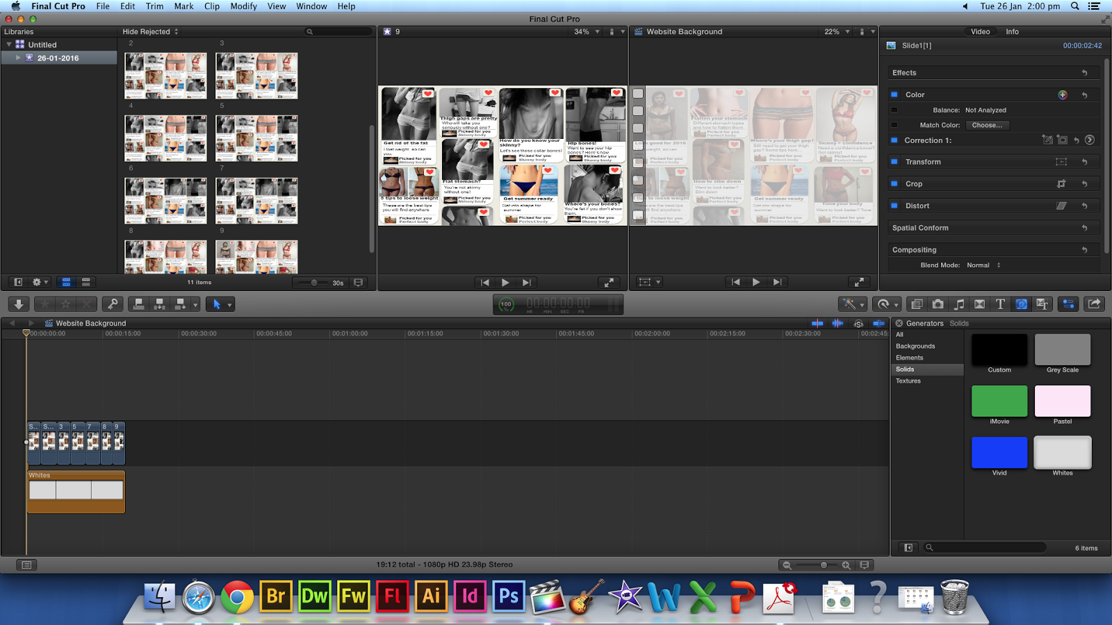
After creating the website background, I realised that there might be a problem with the background as there is writing for the comments of the pictures, like what you see on Pinterest, but because this is a background, it could detract attention from the writing that would be on our website main body. Because of this, I edited the background further to then make it more transparent. 

Here, I played around with the opacity settings of each of the JPEG's in Final Cut Pro and changed these settings from 100% to around 40%, however, because the default background for Final Cut Pro is black, this just made it even darker.


I then found a white background in Final Cut Pro and then added this on top of the JPEG's I had, this then gave the desired effect and made the background seem more transparent. 


 However, after continually watching the background, I thought that the images change too abruptly with just a simple cut, because of this, I added the Cross Dissolve transition on each cut, and now the editing is a lot smoother.  


Here is the finished draft:

However, when uploading this into Wix, the footage was too big, at around 200MB over the limit, so I tried to compress the footage on a free compressing website. 

But, this made the footage too low quality for what I was happy to use for the website. I tried all the different settings that I could, to see if one would work that I would be happy with, however, each time I tried the footage was either still too big, or bad quality. I then went back to the images in Powerpoint and changed the opacity on the slides then I saved them all as a JPEG again and started from scratch in Final Cut. I made each image on the timeline a lot short, as after exploring Wix more I found that you could slow the background footage down after uploading. I then didn't use any transitions, unlike before, as this added more MB's to my footage. I then uploaded this to Wix, and it worked without compressing so the footage was of the quality that I was happy with.

Monday, 18 January 2016

Deconstruction of 'London to Brighton' Trailer - Research for editing

I am going to deconstruct the trailer for 'London to Brighton' to see what is used within the trailer, for research for our own teaser trailer. Because this film is a social realist trailer like our own trailer, it is useful to find conventions within the 'London to Brighton' trailer to for us to use in our own trailer. 


  • 0:03-0:05 is an establishing shot of London to show where the narrative begins
  • 0:05-0:10 is a mid shot of the young female character, Joanne, on her own on the streets of London, which turns into a long shot to show people walking past her with her asking for change, which shows her vulnerability. 
  • The sound also overlaps these shots from the next shot at 0:11-0:14, showing Joanne and an older woman, Kelly, smoking and seeing how old Joanne is. 
  • 0:14-0:16 a review from the Times "Blistering raw, utterly compelling drama" which confirms to the audience that this is a good film and the review has come from a reliable source. 
  • 0:16-0:27 shots of Joanne and Derrick, Derrick asking Joanne if she wants money, she has to go and see someone for him. Showing that he is turning her into a prostitute. She is wearing a hoodie that covers herself up, showing that she isn't sexualising herself and showing her innocence but has a cigarette behind her ear which subverts the idea of her being innocent. 
  • 0:27-0:29 Another film review, from Film Review, "Brutally raw thriller, with sharp serrated edges". 
  • 0:29-0:31 Showing Joanne being driven in a car to meet the 'client', with her having makeup on, which sexualises her. 
  • 0:31-0:34 Mid shots showing all of the shops being shut down, showing that London is run down and the lack of social mobility there is in London. 
  • 0:45-0:47 The 'client' an older man, takes Joanne's hand and walks off with her in his extravagant house.
  • Speech from later on in the film is overlapped with footage from the beginning of the film, used to tell the narrative without needing titles.
  • 0:57-0:59 Another film review from, Big Issue, "The best british film of the century".
  • 1:00-1:09 The first scenes of the film are shown with Joanne crying and Kelly has a black eye, with Kelly trying to rub the make up off Joanne.
  • 1:21-1:23 Another film review from The Scotsman "Reminds you just how good British cinema can be"
  • 1:23-1:29 Shows the ending scenes of the film with Kelly crying and Stuart holding a shotgun.
  • 1:29-1:32 Another film review from The Guardian "Audacious, exciting film making. A dazzling debut"
  • Then the trailer ends at the title.
Conclusion:
From this, I have come to understand that film reviews are very important within social realist films, as researched before, they are generally given a smaller budget and so had a lot less advertising and hire unknown actors. Film reviews from credible sources tell the audience that this is a good film and one that they should see. It also has told me that the shots in the trailer, do not have to be placed in chronological order of them appearing in the film, the narrative is still clear in doing so. 


Thursday, 17 December 2015

Editing

16/12/15


  • After Caitlyn created the typography with white outlines she sent it to me. 
  • We could not add the typography straight to the trailer, because it had no background and would appear too big. 
  • I had the idea that we could add the typography to a powerpoint document and save the slide as a picture
  • I did this, and having resized it and added the 'Festival de Cannes' logo beneath it, saved it. However, upon the first time of adding it to our trailer, we viewed it and the title appeared pixelated until the trailer finished when it would un pixelate. 
  • I then went back to the document and saved it again as a PNG file instead of JPEG, and this time it worked.

Sunday, 15 November 2015

Film Editing- Timelapse

For the time lapse in our teaser trailer, I opted to edit this as I have edited this type before. 

 The shot was very long for a teaser trailer, at around four minutes, so when we would speed this up, the shot wouldn't be to short. 
I then changed the speed of the recording to 2x. However, I didn't think that this was fast enough for the time lapse and asked the group's opinion and they accepted that it should be speed up more.

I then went through from 4x-20x and thought that the 8x was the best for the speed. I asked the group to see what they thought of the speed and they also thought that this was the best one. However, we experienced playback difficulties and I thought that this may be due to the size of the time lapse and how fast it was playing, that final cut pro may not be able to handle it.  
Because of this issue, I tried to make the recording smaller, as the issue could have been the length of the recording. However, this did not make a difference. 
I then tried cutting the time lapse up, thinking that final cut pro may have had difficulties with the speed and the length of the whole recording. Once I did that, the recording worked better then before.

In conclusion, I experienced some technical difficulties that I did not anticipate, however I managed to correct these quickly.