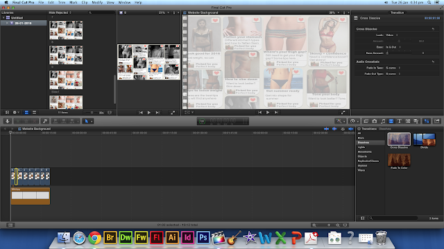
After creating the website background, I realised that there might be a problem with the background as there is writing for the comments of the pictures, like what you see on Pinterest, but because this is a background, it could detract attention from the writing that would be on our website main body. Because of this, I edited the background further to then make it more transparent.
Here, I played around with the opacity settings of each of the JPEG's in Final Cut Pro and changed these settings from 100% to around 40%, however, because the default background for Final Cut Pro is black, this just made it even darker.
I then found a white background in Final Cut Pro and then added this on top of the JPEG's I had, this then gave the desired effect and made the background seem more transparent.
However, after continually watching the background, I thought that the images change too abruptly with just a simple cut, because of this, I added the Cross Dissolve transition on each cut, and now the editing is a lot smoother.

Here is the finished draft:
However, when uploading this into Wix, the footage was too big, at around 200MB over the limit, so I tried to compress the footage on a free compressing website.
But, this made the footage too low quality for what I was happy to use for the website. I tried all the different settings that I could, to see if one would work that I would be happy with, however, each time I tried the footage was either still too big, or bad quality. I then went back to the images in Powerpoint and changed the opacity on the slides then I saved them all as a JPEG again and started from scratch in Final Cut. I made each image on the timeline a lot short, as after exploring Wix more I found that you could slow the background footage down after uploading. I then didn't use any transitions, unlike before, as this added more MB's to my footage. I then uploaded this to Wix, and it worked without compressing so the footage was of the quality that I was happy with.


No comments:
Post a Comment