Blog Archive

Showing posts with label Website. Show all posts

Thursday, 4 February 2016

Website editing after audience assessment

After getting the audience of our film to assess our website, we were given some corrections that we could make so, for them, it would be more conventional and what they want to see in a website for a new film, as part of a promotional package. 

First of all, the boxes at the bottom of the website were too big, and they didn't seem conventional for a film website. So, to correct this, I took out the boxes, but kept the text, then added arrows next to the text. I then linked these arrows with the Blog and Charities pages so these could act as buttons. 


We were also told that on a different computer, the social networking icons weren't visible, so to correct this, I moved the typography and the menu down so then I could put the these social networking links at the very top of the page.


We were then told that the boxes on the right hand side, including the Cannes film festival and our production companies were not conventional. To change this, I deleted the boxes and then made the three images black and white and deleted the background. I then moved these to be near the other parts of the text. Editing them to be black and white made them merge in more with the website's theme and they didn't stand out too much.


I was also told that the reviews were too big and so were the reviews' stars as they took up too much space for the website when seen on a different computer. Because of this, I made these smaller and moved them closer together. This also made it look like there was a lot less writing then there was because the text is very small.


Here is what the finished website now looks like:

Tuesday, 2 February 2016

Website Design

For the website, included in our promotional package for the film, I designed the layout. For this, I have used the website Wix, an online website builder.

For our menu, I added "Home","Behind The Scenes", "Blog" and "Charities". From research into other film websites, we have seen different types of 'Behind the Scenes' pages and thought that it would be a good addition to our website because our trailer would have a niche audience, and a very low budget therefore not a commercial film, it would allow the audience to identify with the characters more and would be a chance, to get to know them. The Blog page, I thought, is also an important addition to our website because our film highlights on social and moral issues, it would give a chance for our audience to debate and discuss different issues that could be brought up in our film, or different issues that the audience wish to discuss with other like-minded people. It gives the audience a chance to interact with another giving them a shared experience. Also the charities is something that I have seen on very few websites, however I thought that it was important to add in because our trailer highlights some harsh issues that our audience may be able to relate to in their lives, so the website would include different charities like ChildLine to allow our audience to seek help with their own problems, like Eating Disorders, which plays a prominent part in our trailer. 


I have included the same typography that we have used in our trailer and poster to make sure that we have consistency flowing through our whole promotional campaign. Throughout the website also, I have kept to the same colours as the typography as these colours are a theme shown throughout our promotional campaign. I also linked the typography with the home page, so when the audience is on a different page like the 'Blog' page, the title acts as a link back to the home page also. 


After researching, Georgie gave me different reviews that are conventional of film websites, so I typed these into our website and changed the colours of them to fit our colour pattern. I also added the star ratings, which is also something that we found conventional of film reviews. 


Here, I added production company stills and the logo from the Cannes Film Festival. This is something that I have seen in past students work and so thought I should add this in as it promotes the production companies that have 'produced' our film.


I have embedded the trailer into our website so the audience of the website can see what the film is about straight away, and it also makes our trailer more accessible.


Here, I have added extra buttons to pages and I have linked them up to the appropriate pages, this gives more of a description for the Blog and the Charities pages and also acts as a link also. 


I have also added links to different social media accounts. The social media account links are important to include because it widens our audience and also because our film wouldn't have been a commercial film as it is a social realist, and so typically would have a lower budget, it would advertise our film through social media. It is also important to add these links as social media is an important part of our film concept as it is to do with trolling, and Pinterest and Facebook have been included in our trailer alone. 


Monday, 1 February 2016

Editing Website

  • Before publishing our website we did some alterations to it to ensure that it fitted on the screen of a desktop computer as well as the Macs we were using to edit it.
  • We did this by having the version we were editing open on the Mac and a version to refresh when we made an alteration on a desktop computer in the room next door.
  • When we first looked at the website on the desktop we realised that quite a lot of items on the page needed to be pulled to the left as the page needed to be scrolled horizontally across to see all the information. One example of this is with our tabs at the top of the page. To fix this I dragged the editing box they were in to make it smaller, and therefore the four tabs now fitted on the desktop screen.
  • Another problem was the stars for the reviews became very distant from each other (for example 4 together then one several spaces away). This was easy to fix by making the stars smaller.
  • One major problem was that the social media links had to be scrolled down to access. This was fixed simply by dragging them up and checking on the desktop that they were now visible.
  • Finally, before uploading it we added the newest version of the trailer so that it was up to date.

Tuesday, 26 January 2016

Editing the website background draft


After creating the website background, I realised that there might be a problem with the background as there is writing for the comments of the pictures, like what you see on Pinterest, but because this is a background, it could detract attention from the writing that would be on our website main body. Because of this, I edited the background further to then make it more transparent. 

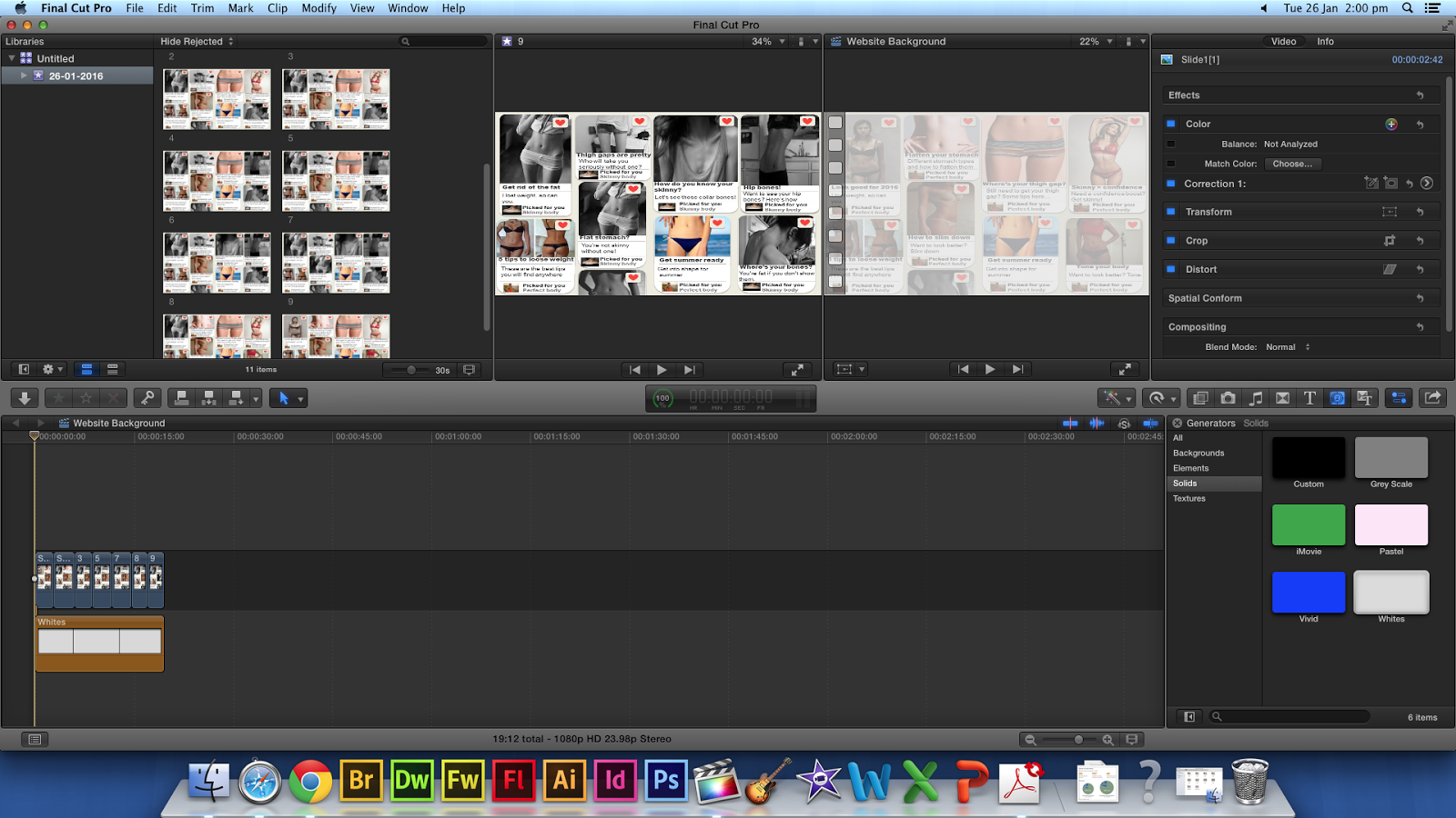
Here, I played around with the opacity settings of each of the JPEG's in Final Cut Pro and changed these settings from 100% to around 40%, however, because the default background for Final Cut Pro is black, this just made it even darker.


I then found a white background in Final Cut Pro and then added this on top of the JPEG's I had, this then gave the desired effect and made the background seem more transparent. 


 However, after continually watching the background, I thought that the images change too abruptly with just a simple cut, because of this, I added the Cross Dissolve transition on each cut, and now the editing is a lot smoother.  


Here is the finished draft:

However, when uploading this into Wix, the footage was too big, at around 200MB over the limit, so I tried to compress the footage on a free compressing website. 

But, this made the footage too low quality for what I was happy to use for the website. I tried all the different settings that I could, to see if one would work that I would be happy with, however, each time I tried the footage was either still too big, or bad quality. I then went back to the images in Powerpoint and changed the opacity on the slides then I saved them all as a JPEG again and started from scratch in Final Cut. I made each image on the timeline a lot short, as after exploring Wix more I found that you could slow the background footage down after uploading. I then didn't use any transitions, unlike before, as this added more MB's to my footage. I then uploaded this to Wix, and it worked without compressing so the footage was of the quality that I was happy with.

Website background design

For our website background, we wanted it to show different images of the perfect body that our character would aspire to look like. We wanted the background to also change the images into more distressing images like people who are too skinny, to show the character's journey into becoming obsessed with being skinny. 

We thought that it would be better for the images to appear on a social media, like Pinterest as this would incorporate the idea of body shaming across the internet, like how the character is bullied on Facebook in our trailer. However, I didn't want us to just print screen Pinterest, so I created pages to look similar to Pinterest. 

For this, I edited the pages on different slides of Powerpoint, this is because its a simple program to use, and I knew that it had all the tools I needed to make it work. 

I made the background an off white colour to mimic Pinterest's background. I then added different sizes of the squares with rounded edges and then softened the edges to make it look more like Pinterest. I then started to add different images of 'perfect' bodies from the internet and added a white box at the bottom for room to write descriptions of images and headings for entries like Pinterest, for example "5 easy tips to slim down". 

Once I had added all the images in, I then added comments about them and created the heart button that is seen on Pinterest. 


This is one of the finished slides, I added different pictures of people's perception of beauty to a somewhat extreme extent, like bones showing through skin. With the images that are extreme I have changed the comments and who they have been posted by, to show that the character's idea of the perfect body has changed and that she feels this is her inspiration.


I have saved the slides, each time I have changed one of the boxes from the 'Perfect body' to the 'Skinny body' images, and I have saved them as a JPEG. I then imported all of these JPEG's into Final Cut Pro.


I then put in each of the images in order to make sure that the video would continue properly for the desired effect.


After cropping the images' duration, the page continues to change from more 'comfortable' body image representations to more extreme representations, showing the characters change of aspiration. 


In conclusion, the background works really well, the only problem would be that if this is chosen by the rest of the group to be the background of our website, the writing of the comments from the background could distract from the writing that would be on the website. This could be fixed by making the background more transparent and is something that we would have to look into, whether we can do this on Final Cut Pro, or our website design site that we are using, Wix.

Sunday, 24 January 2016

Website Deconstruction


Evaluation
After this deconstruction, we have been able to fully research film posters within and without our chosen genre, and so are now aware of the conventions that we must/could follow so as to appeal to our target audience and to conform to conventions so as to make the website seem as professional as possible. As ours is a social realist film, it is difficult to discover existing film websites in this genre. However, I found the Broken Circle Breakdown, and so we will be able to take inspiration from this poster, such as the use of little content. however, as our film largely focuses on the influence of social media, these links will most definitely be included as they are an integral part of the plot for our film.

Sunday, 17 January 2016

Review Creations

For our film poster, it was decided that I will be the one to create the film reviews. In order to do this, I looked at existing posters and websites and the reviews they have written on them.

 This poster uses one word reviews, consisting of adjectives that paint the film in a very positive light. This compliments their poster well as the large image takes up most of the screen, and the reviews are simple, but make large statements and are to the point. However, as there will be a large amount of blank space on our poster, I do not think we will take inspiration from this poster as such, though the adjectives themselves could be used a larger review option. The reviews for this poster were from Time Out, a free urban magazine with an intended male target audience, which suggests that their target audience is males, and so we could mimic this to appeal to a female audience.

I took a slight inspiration from this and created the review "Visually stunning, a cinematic masterpiece" - I manipulated the adjective 'stunning' to compliment the editing style and the cinematography used in the film, as cinematographies are an important aspect that can aid in the success of the film.

This poster uses star reviews, which we could take inspiration, as this is a simple stylistic techniques that immediately conveys the sense that the film is approved of. Also, it features short reviews, such as "funny, profound and moving" and "Jarvis and Fassbender are outstanding". I will take inspiration from both of these reviews, as the latter praises the actors in the film, and the forming suggests the genre as it reveals a complexity of plot.
Therefore, I have created the review "A tragically accurate portrayal of today's society, and what a gem Bartram is!" The use of "tragically" suggests the tone of the film, and the review reveals the genre. 


This poster only uses one review that reveals the genre, as it states that it is a coming-of-age film, which establishes the target audience as young adults. The use of the intensifier 'best' emphasises the quality at which they are rating the film, and would appeal to a wide audience range.
Taking inspiration from this, I have created the review "One of the most inspiring films I have ever seen - I will definitely be recommending this to everyone I know!" Rather than 'best', I used the intensifier 'most', and I coupled this with "one of" similar to the review in the above poster because although you wish to praise your film, you do not want to come across as arrogant, because this may not appeal to viewers. Also, I included the exclamative as this implies that the person liked the film so much that they believe others will enjoy it too. I chose 'inspiring' as that is the main aim of our film - to inspire others into actively seeking a way to combat eating disorders.

Kidulthood also uses a star rating as well as an actual review. In the review, rule of thirds is used to add emphasis, and the imagery in the metaphor is in the semantic field of violence, and so relates well to the plot and genre of the film. Therefore, for our own reviews, I will consider using language that connotes our topic and genre so as to appeal to the target audience.

In addition to those aforementioned, I have also created the following reviews:
"Heart achingly raw, this is one of those films that stay with you for the rest of your life"
"Powerful and moving, this tackles the prominent issues of society in a beautiful way."
"The depth of feeling manifested in Ellie Bartram's acting is truly amazing."
"An emotional rollercoaster - one I won't be forgetting any time soon! Watson has artfully portrayed the harsh reality of society today, and every young girl should watch this film"

In these reviews I have complimented the main actor and the director, and in each I have implied the genre of the film through my choice of language. Exclamatory sentences are used to created emphasis and to make the reviews more emotive, and the reviews also target the directed audience by referring to them directly.

Evaluation
This deconstruction aided in my creation of the reviews for the website and poster. We have decided that, similar to Fishtanks, we will include star ratings, but only on the reviews on our website, and, as convention generally dictates, we will only have one review on the poster, as the aim of the poster is to appeal to the target audience and provide information, and we believe that too many reviews will take up too much of our poster and could distract from the main image.

Thursday, 7 January 2016

Website Background Trial Idea

The idea:

As our piece was based upon a body shaming idea, as a group we decided that the website background had to reflect this and I came up with the idea of having a body with several sections such as the face, below the neck to waist, waist to part of the legs and the legs, that had images changing all representing the idea of what is considered the ideal body by teens.  The media also helped with this in regards to them constantly publicising these types of images.

The images:

The images were all found on google under several different titles such as 'the ideal body' or 'thigh gap' etc.  the images we used were based on a set of criteria that we found online conforming to the super skinny ideal body type.  The criteria is as listed below from http://www.harpersbazaar.com/beauty/diet-fitness/a11239/the-new-body-ideal/:


  • According to Dr. Stephen J. Greenberg, a top plastic surgeon currently starring on Bravo's Secrets and Wives, the answer seems to point toward yes.

  • "Women are asking for larger, but more natural-looking breasts as well as enhanced buttocks, rounder hips and slimmer thighs," he says, adding that requests for Kardashian-esque butts are at an all-time high and that while some women may be born with a thigh gap, most require inner thigh laser lipo to remove exercise-resistant fat. 

  • "Using liposuction to shrink certain areas and liposuction combined with fat transfers to enhance others is definitely the new trend. 

  • " As for waist trainers, they're likely not the reason celebrity waists are becoming more whittled than ever: "It's unrealistic to expect that these devices can fundamentally change body shape," says plastic surgeon Dr. David Hidalgo. 

  • Plus, "there are potentially damaging physiologic consequences, including restricted breathing from interference with normal movement of the diaphragm, pooling of blood in the legs which could encourage clots to form and interference with function of the gastrointestinal tract." 

  • This cartoon-like hourglass figure (Jessica Rabbit certainly comes to mind) that is topping our feeds, covering glossy fashion magazines and changing the way we look at our own bodies in the mirror is about as unrealistic to achieve naturally as Kim Kardashian's reality show. 

The Images from google:

The picture below shows how they were layered up in the order that they would appear on the screen when joined with the fly in and out transitions as found on PowerPoint.  Although Powerpoint is not the ideal programme to use, it provided us with an idea of how it would potentially look on the website. 

The layering up of the images in Powerpoint to show the order in which they go in

The images below are all the images found on google that I used within the trial run of the website background.  Although the removal of the background led to it not being fully removed or pieces being removed that shouldn't be, again it was just to provide an idea of what it would look like.
All the images used within the trial piece

The Trial run


Evaluation

The idea of creating a background like this represents our idea of body shaming really well as it continually creates what is assumed to be the ideal or perfect female body and highlights the negativity surrounding the images.

However the cropping of the images is done poorly to the point where some of the body parts needed have been cropped too much or changed so that they have parts missing or they look oddly shaped.