Blog Archive

Showing posts with label Stacey Nixon. Show all posts

Thursday, 21 April 2016

Evaluation Questions

Question One
In What Ways Does Your Media Product Use, Develop, or Challenge Forms and Conventions of Real Media Products?


Question Two
How Effective is the Combination of your Main Product and Ancillary Texts?
Part One


Part Two


Part Three


Question Three
What Have You Learned From Your Audience Feedback?


Question Four
How Did You Use Media Technologies in the Construction and Research, Planning and Evaluation Stages?


Monday, 1 February 2016

Billings Block

The three examples of Billings Block from pre-existing films

Billings Block

The Research Stages

As we have never created a billings block before, we did lots of research into aspects of them and the different formats in which they could be designed in.  I took three different examples from Google Images from pre-existing films such as 'The Dark Knight Rises', 'Argo' and 'Old Stock'.

Each of the billings blocks had slightly different layouts and styling clearly shown by 'The Dark Knight Rises' and 'Old Stock' in which there are more lines and an age rating for the film in 'The Dark Knight Rises' compared to 'Old Stock'.  Also when looking at both Billing's blocks, they also had the logos of the production companies underneath the main block of text however we were unsure as to whether or not we wanted to include this into our billings block.


Creating the billings block for "Eatin' me up"
From looking at pre-existing examples, I went on to look at the members from the production team that were included into all three billings blocks.  All three of them had the name, production companies and the supporting actors names within the first three lines however, in the lines below they differed in terms of who they included.  On the left, is the start of the billings block with ideas included from all three pre-made ones in terms of layout and content.


Originally, we decided to go with the layout of 'Old Stock' due to it being straight forward in terms of the positioning of the content e.g. on the first line it states 'the major production company presents', with the title of the film on the next line and the rest of the information on the lines below that.


As a group we decided on the names to put within the billings block as part of the crew for the film and ended up choosing relatives' names and some were characters from our favourite TV shows and we put them into a generic order.

Research into the fonts used on the billings block
From there I carried out research into the types of fonts used for the billings block as the fonts found on the computer were not suitable due to them being too rounded compared to the fonts seen on the pre-existing  billings blocks.  After looking at several different sites, I found a website which provided a list of several different fonts that would be suitable.  A problem I encountered was that due to us using school's Apple Macs to create our trailer, poster and website on, I was unable to download any new fonts onto the computer due to the retractions on the macs for downloading but also with the restrictions in place on what can be downloaded at school.


To counter this problem, I clicked onto the font to see it in image form and zoomed in so that it was of a reasonable size and print screened it so that I would be able to cut and crop the image.  I thought that by cutting out the individual letters from the screenshot, we could create the billings block this way so that it meant that we didn't have to download the font and we could change the image as we pleased.
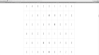
The font chosen
I soon discovered that this was not the case as the screenshot had a white background and black text, which was the opposite of what we wanted.  However, I decided to see if putting the letters together was a good idea still, but it was very time consuming as I had to make sure that all the letters were the same height and distance apart but also I had to remove the background on most of the letters, which didn't fully remove itself when I tried to do this.


My attempt to try and recreate a billings block
From there, I opened up Photoshop and clicked on a new document with a transparent background so that it could be moved onto different coloured backgrounds such as within the trailer and also onto the poster.  I then copied the text from Powerpoint into Photoshop and manipulated it from there due to Photoshop having a larger variety of fonts.

After settling on a font that best matched the font used in the pre-existing billings block, we just changed the sizing of some of the font so that the titles of the jobs that people had were smaller than the names to following the layout of a typical billings block as shown in the three examples I found on Google.


Evaluation

Photoshop billings block
Overall, creating the billings block itself was fairly straightforward however choosing the right layout was difficult.  Also I believe that I should have carried out better research into the type of fonts used to make it look more professional.

Wednesday, 27 January 2016

Editing

Editing

The Clip


How I edited the clip


    Adding clip to timeline
  •  To start with I opened up a new project in Final Cut Pro so I could focus on the clip and check the individual quality of it before adding it into the main storyline.

  • Once the footage was imported into Final Cut Pro, I dragged it and dropped it onto the timeline so I could begin to edit it.


  • To start with I played the whole clip so I could see where I would most likely crop it before making the final changes to the clip.


    Detaching the audio
  •  After playing the footage a couple of times, I detached the audio by right clicking on it and selecting the 'detach audio' option in the menu that appeared.


  • This then appeared below the footage in a green audio section which I then deleted so that when the music for our piece was added to the main project, then there wouldn't be any background noise to the piece.


  • As the footage was too long, I then proceeded to cut it down to 2 seconds long so that it would fit into it's allotted space. 
  • Detached audio
  •  I did this by going to the small arrow button at the end of the first section of buttons in the light grey strip above the timeline and selecting the blade option.


  • Using the blade tool, I cut the footage into three sections, the middle section being the one I wanted to keep and the two outer sections being the footage that I wanted to delete.


    Blade tool
  • After deleting the excess footage from the timeline and the black space they left behind, I then played the clip again to make sure I had cut it down to the size I wanted and to make sure it showed the best part of the footage I had filmed at home.


  •  As the footage had some space at the beginning of it that I didn't want as it showed a pause before the playing of the clip, I then hovered over the start of the footage until it turned into a yellow bracket round of the start of the footage.


  • When it turned yellow, I clicked and dragged it inwards to remove the footage that needed to be deleted and then I rechecked the shot.


    The clip split up into the three sections
  • I watched the footage several times and dragged in the yellow line from either end of the footage to remove the unwanted parts until I was completely satisfied with the length and quality of the clip.


  • After I had finished editing, I then went to 'File' and then clicked onto 'Share' and saved the footage as a Master File (default) to check the quality once more before sending it to the other members in the group.


    Deleting the excess footage
  • From there, we saved the footage and added it onto the right account for Final Cut Pro to add it into the main timeline for our teaser trailer.

 The Final piece


Tuesday, 26 January 2016

Filming Evaluation- 26th January 2016

Shooting Evaluation

Date filmed: 26th January 2016
Shot: Food scene where the food is moved around the plate- The food not being eaten and only the hand being shown in the shot to move the food round the plate to make it look as though she has eaten.

Shot Filmed:


Evaluation:
The quality of the video was good due to the digital camera being held steadily.  However, next time I believe that the use of a tripod would greatly improve the shot and also perhaps a different place would be better to have filmed.

I am pleased with the lighting as it highlights what's in the shot well and also there is no artificial tint as there was on the previous shot.

Monday, 25 January 2016

Filming Script for 26th January 2016

Shooting Script

Date to filmed: 26th January 2016
Where: My House
Going: Stacey

Filmed by: TBC
Type of Filming: Hand-held
Shot: Food scene where the food is moved around the plate

Equipment needed: Camera and a Meal
What does the scene need to show: The food not being eaten and only the hand being shown in the shot to move the food round the plate to make it look as though she has eaten.

Shot from the Storyboard:
Food Scene

Thursday, 7 January 2016

Website Background Trial Idea

The idea:

As our piece was based upon a body shaming idea, as a group we decided that the website background had to reflect this and I came up with the idea of having a body with several sections such as the face, below the neck to waist, waist to part of the legs and the legs, that had images changing all representing the idea of what is considered the ideal body by teens.  The media also helped with this in regards to them constantly publicising these types of images.

The images:

The images were all found on google under several different titles such as 'the ideal body' or 'thigh gap' etc.  the images we used were based on a set of criteria that we found online conforming to the super skinny ideal body type.  The criteria is as listed below from http://www.harpersbazaar.com/beauty/diet-fitness/a11239/the-new-body-ideal/:


  • According to Dr. Stephen J. Greenberg, a top plastic surgeon currently starring on Bravo's Secrets and Wives, the answer seems to point toward yes.

  • "Women are asking for larger, but more natural-looking breasts as well as enhanced buttocks, rounder hips and slimmer thighs," he says, adding that requests for Kardashian-esque butts are at an all-time high and that while some women may be born with a thigh gap, most require inner thigh laser lipo to remove exercise-resistant fat. 

  • "Using liposuction to shrink certain areas and liposuction combined with fat transfers to enhance others is definitely the new trend. 

  • " As for waist trainers, they're likely not the reason celebrity waists are becoming more whittled than ever: "It's unrealistic to expect that these devices can fundamentally change body shape," says plastic surgeon Dr. David Hidalgo. 

  • Plus, "there are potentially damaging physiologic consequences, including restricted breathing from interference with normal movement of the diaphragm, pooling of blood in the legs which could encourage clots to form and interference with function of the gastrointestinal tract." 

  • This cartoon-like hourglass figure (Jessica Rabbit certainly comes to mind) that is topping our feeds, covering glossy fashion magazines and changing the way we look at our own bodies in the mirror is about as unrealistic to achieve naturally as Kim Kardashian's reality show. 

The Images from google:

The picture below shows how they were layered up in the order that they would appear on the screen when joined with the fly in and out transitions as found on PowerPoint.  Although Powerpoint is not the ideal programme to use, it provided us with an idea of how it would potentially look on the website. 

The layering up of the images in Powerpoint to show the order in which they go in

The images below are all the images found on google that I used within the trial run of the website background.  Although the removal of the background led to it not being fully removed or pieces being removed that shouldn't be, again it was just to provide an idea of what it would look like.
All the images used within the trial piece

The Trial run


Evaluation

The idea of creating a background like this represents our idea of body shaming really well as it continually creates what is assumed to be the ideal or perfect female body and highlights the negativity surrounding the images.

However the cropping of the images is done poorly to the point where some of the body parts needed have been cropped too much or changed so that they have parts missing or they look oddly shaped.

Friday, 11 December 2015

Lighting Practical

The original setting

Lighting Practical

 As we are filming a lot on location for our piece, I thought it would be a good idea to see what kind of lighting would be a good idea to use to create the mood we wanted for our piece.

I used the indoor cage with my rabbit and guinea pig in it as the subjects as they were a stationary object in a place where the light is easy to manipulate.
All the lights on

To start with, I took a photo of them with no lights on in the room and the light coming in from the room next door to see what effect this had.  It light up the room fairly well however there were some shadows which perhaps we wouldn't want in our piece.

One curtain closed and no lights
The second photo I took was when I turned on all the lights in the room.  Due to the lights being blue LED lights, they gave the room and the photo a blue-ish tint but it light up the room really well with no unnecessary shadows.  This would be useful for us to know because if we film on a day which is darker outside, we then have a good idea of what the shot could look like if we put the lights on.

Both curtains closed and lights off
The third shot i did was with the lights off in the room again and with one of the curtains closed to see how badly the loss of lighting from half of the screen would affect the photo.  As shown to the right, the photo wasn't that badly effected as the subject was still fully lit and there wasn't any shadows in the shot that would affect it.

The last shot I took was with both the curtains closed but with the lights still on in the other room.  This meant that some light could still get through but it didn't illuminate the subject of the photo particularly well. Therefore I recommend that this set up is only used if there is an effective and bright enough light source behind the curtains.  However, this lighting could be used in the scene where the protagonist is having a sleepover with her friends but is shown to be alienating and distancing herself from them.