 |
| The three examples of Billings Block from pre-existing films |
Billings Block
The Research Stages
As we have never created a billings block before, we did lots of research into aspects of them and the different formats in which they could be designed in. I took three different examples from Google Images from pre-existing films such as 'The Dark Knight Rises', 'Argo' and 'Old Stock'.
Each of the billings blocks had slightly different layouts and styling clearly shown by 'The Dark Knight Rises' and 'Old Stock' in which there are more lines and an age rating for the film in 'The Dark Knight Rises' compared to 'Old Stock'. Also when looking at both Billing's blocks, they also had the logos of the production companies underneath the main block of text however we were unsure as to whether or not we wanted to include this into our billings block.
 |
| Creating the billings block for "Eatin' me up" |
From looking at pre-existing examples, I went on to look at the members from the production team that were included into all three billings blocks. All three of them had the name, production companies and the supporting actors names within the first three lines however, in the lines below they differed in terms of who they included. On the left, is the start of the billings block with ideas included from all three pre-made ones in terms of layout and content.
Originally, we decided to go with the layout of 'Old Stock' due to it being straight forward in terms of the positioning of the content e.g. on the first line it states 'the major production company presents', with the title of the film on the next line and the rest of the information on the lines below that.
As a group we decided on the names to put within the billings block as part of the crew for the film and ended up choosing relatives' names and some were characters from our favourite TV shows and we put them into a generic order.
 |
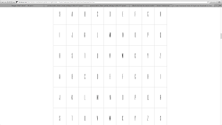
| Research into the fonts used on the billings block |
From there I carried out research into the types of fonts used for the billings block as the fonts found on the computer were not suitable due to them being too rounded compared to the fonts seen on the pre-existing billings blocks. After looking at several different sites, I found a website which provided a list of several different fonts that would be suitable. A problem I encountered was that due to us using school's Apple Macs to create our trailer, poster and website on, I was unable to download any new fonts onto the computer due to the retractions on the macs for downloading but also with the restrictions in place on what can be downloaded at school.
To counter this problem, I clicked onto the font to see it in image form and zoomed in so that it was of a reasonable size and print screened it so that I would be able to cut and crop the image. I thought that by cutting out the individual letters from the screenshot, we could create the billings block this way so that it meant that we didn't have to download the font and we could change the image as we pleased.
 |
| The font chosen |
I soon discovered that this was not the case as the screenshot had a white background and black text, which was the opposite of what we wanted. However, I decided to see if putting the letters together was a good idea still, but it was very time consuming as I had to make sure that all the letters were the same height and distance apart but also I had to remove the background on most of the letters, which didn't fully remove itself when I tried to do this.
 |
| My attempt to try and recreate a billings block |
From there, I opened up Photoshop and clicked on a new document with a transparent background so that it could be moved onto different coloured backgrounds such as within the trailer and also onto the poster. I then copied the text from Powerpoint into Photoshop and manipulated it from there due to Photoshop having a larger variety of fonts.
After settling on a font that best matched the font used in the pre-existing billings block, we just changed the sizing of some of the font so that the titles of the jobs that people had were smaller than the names to following the layout of a typical billings block as shown in the three examples I found on Google.
Evaluation
 |
| Photoshop billings block |
Overall, creating the billings block itself was fairly straightforward however choosing the right layout was difficult. Also I believe that I should have carried out better research into the type of fonts used to make it look more professional.


No comments:
Post a Comment