Blog Archive

Thursday, 21 April 2016

Evaluation Questions

Question One
In What Ways Does Your Media Product Use, Develop, or Challenge Forms and Conventions of Real Media Products?


Question Two
How Effective is the Combination of your Main Product and Ancillary Texts?
Part One


Part Two


Part Three


Question Three
What Have You Learned From Your Audience Feedback?


Question Four
How Did You Use Media Technologies in the Construction and Research, Planning and Evaluation Stages?


Monday, 8 February 2016

Changes to Soundtrack According to Peer Feedback

Having shown our trailer to peers we collected some feedback on which we could improve our trailers. For me, this meant making a few edits to the soundtrack. Comments that we got were that there was not enough happening and not enough defining moments within the music. 

To tackle this issue I reviewed our trailer and decided one pinnacle moment that I could define through sound was when we see the mirror being punched. I did debate using a shattering glass effect, however was not convinced it would be effective and may take away from the rest of the trailer.


Instead of this I found an Apple loop named 'Boom 3', which fitted in well with the trailer.


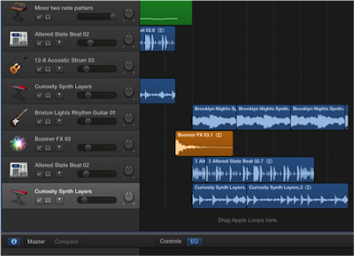
Upon finding the section of the music where this occurred, I added the loop in. The loop does, however, have quite a lengthy reverb which I didn't want to carry on. To lessen this I used the track tool on Garageband and pulled the ending in towards the climactic moment at the beginning of this effect. 


This was effective, however with the music over the top of it, despite altering the dynamic contrast it still became hidden. To sort this issue I remembered a common convention in soundtracks for the social realist genre, that there is normally a gap in music when some thing has happened. 


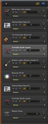
I was able to utilise this convention and did so by splitting the ongoing sounds at the region head and dragging them down to a separate track. Other than enabling me to accurate move them to where  wanted them on the track, it also allowed me to edit the dynamics. 


By editing the dynamics in the final section of music I enabled the 'Brixton Lights' sound to be the overriding sound over the 'altered state beat' and 'curiosity synth'. This also implied to an audience that a new section and atmosphere had been created.


Another thing which I decided to do with the music was to pan the different sounds. I did this so that not all the music would aurally be on top of each other, allowing an audience to clearly be able to hear the different sounds. 


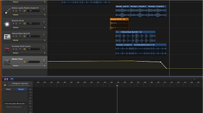
Finally, I decided that I would fade out the music using Garageband, instead of doing it on Final Cut Pro. I did this using the master volume control which gave me a lot more control about when and how quickly the sound would fade.

To evaluate, I believe this new edited music has now been edited to fit with the changes suggested in our peer feedback, therefore producing a much better soundtrack than previously created.


Poster editing after audience feedback

After having some audience feedback, we were given some points that we needed to change about our film poster, and so I chose to edit these points.


For the names of the actors involved in the film, instead of the names, along with the actors last names, being on one line, I separated the actors' last names and their first names and then put their last names on a new line underneath. This uses up a bit more space where the top half of our poster seemed too empty. It also uses a convention of posters and more often then not, this is how their actor's names are shown if they are included on the top of the poster like this. 

I then changed the review that is in the middle portion of our poster. I took out the star rating, which is something that came up in our audience feedback, as the stars crowded the review too much because the review is quite long already. I also changed the reviewer as Andrea Arnold reviewing our film has more sustenance as the film directed by her, Fish Tank, influenced us a great deal, along with the fact she is a director in the genre of our film. 


I also edited the tagline of the film, I thought that it would tie in nicely if the "dying" would be in the same colour as the "Me" in our typography for the title. I tried this, however the colour got lost in the background. I then gave the text of the tagline a border, going to the 'fx' tab, once I had selected the right layer. I then used the "strokes" option, and the setting was already at 3, but I thought that the text then looked too bold, so I changed this down to 1. This helped to make the "dying" more visible. 


I think that these small changes have improved our poster a lot and has made it more conventional, which is what we were aiming for. 

Creating titles

Whilst editing our trailer, I came up with the placement of our titles, their content and their aesthetics. To aid this, I looked back on past research I had done for titles, and I also looked at the titles used in 'Fish Tank' as this is a social realist film that we have taken a lot of inspiration from and would have a similar style of titles. 


For the first title that is used in the trailer, it reads "At six she wanted a barbie doll..." this suggests of the main character's, Jane's, happiness and innocence as a child. The font I chose was Lantinghei SC, which is a thin, simple sans serif font. We wanted it to be a clean, simple font to highlight the superficial aspects that is shown in the media. We also experimented in the typography in the film that I made, with blues in the text, and so I wanted to replicate this, which the blue highlights specific words to emphasise them. 

The next title says "At eighteen she wanted to be one". Again, the "be" is emphasised by being a different colour to the rest. The style of the title, along with the first title is a narrative style as it accompanies the shots to give more information about the narrative of the trailer. This title shows the transition from the child at six being happy and innocent, to her now at eighteen striving for perfection, which ultimately initiates her downfall. 


The next title says "From the award winning director Caitlyn Watson", which is a convention in trailers to show the name of the director of the film. Especially if the trailer has a low budget, the past works of the director could bring in fans and the audience for this new film. 


For the next trailer, it reads "A girl's internal struggle", which has gone back to the narrative style of the first two titles. It gives a description of the film and tells the audience what they are in for in terms of content in the film, showing that the film is about the character's struggle, without explicitly saying that it is a struggle with an eating disorder, this information is left for the shots. 


This title reads "Introducing Best Newcomer Ellie Bartram". This is similar to a title that we saw in the Fish Tank trailer. Because the actor of Katie Jarvis was relatively unknown and wasn't even an actor before the film of Fish Tank, this introduces her into the film and shows that she is something new and exciting. 


This is the end title screen for our film, it includes the typography that I created earlier for the film. I had to edit the typography to have a white border around it as we wanted a black background for the titles, the black of the "Eating" and "Up" was before, lost in the background. I also added the Cannes film festival logo at the bottom to imitate that the film would have been shown at the film festival as it is a prestigious film festival, especially for indie films. 


We then included an ending title after the title showing the typography which reads "Coming Soon", to reinforce that this is a teaser trailer because it hasn't given a release date as yet. This title page also includes the billings block, which is conventional of trailers. 


Cyberbully (2015) trailer inspiration

Cyberbully (2015) follows the life of the main character, Casey, who is subjected to cyberbullying by an anonymous user. She is trying to protect her identity while the anonymous user blackmails her with leaking images and information about her. Unlike most bullying films, which are normally shown in a social realist genre, this film is a thriller and shows the danger of the internet. 


We used the plot of the trailer for the film to inspire our own trailer's concept. We knew that we wanted to show how trolling (which is used to represent society) can affect people online and so we wanted to look at different films or trailers that incorporates the idea of bullying and the internet, with social media to see how they portray this. 

During the trailer for Cyberbully, the antagonist, the anonymous user is only shown to be on the computer, the audience do not see the face of the character at all, which unnerves the audience as well as the characters. The only interaction shown between Casey and the anonymous user, is him talking through speech modification software, this creates more fear as the voice sounds somewhat off to what is expected, which is explored by the 'uncanny valley' theory.

The 'uncanny valley' theory is mostly used for aesthetics, however it could be related to the idea of using speech modification software used in the trailer. It is the idea that things that look too near human, like advanced robots, but still have something not quite human about them, it scares humans because there is something that isn't quite right about them. 

Throughout the trailer, the voice of the anonymous user says things like "you think you are the victim? you're not the victim, Casey". These are comments that are typically used by cyber bullies or thoughts from the victims. 

I think that the horrific way that cyberbullying is portrayed in this is very interesting, and is something that inspired us in a way to go down the route an eating disorder in our trailer, along with the disturbing images seen in the website background and poster. However, because we wanted to create a social realist film, we wanted to show cyberbullying realistically, rather then in this film how it is emphasised to give a horrific effect. 

Sunday, 7 February 2016

Re-editing Film Poster

Audience feedback that we received revealed that the positioning of the text at the top of our poster was not conventional, and was a little difficult to read as it seemed random.
Therefore, I have decided to look at social realist film posters in order to discover where this information should be placed.

The first poster I looked at was the one for Shank. This has a central title, with the name of the actors placed just above, the director mention placed next to the title, and the tagline placed at the top of the screen. However, audience feedback implied that the positioning of our tagline - just below the title - was effective

I began my reedit on Photoshop by moving the name of the actors to the top of the poster, as I found that this was conventional of social realist films, as demonstrated below.


In order to do this, I had to select the T icon, which then allowed me to move the text onto one line, with spaces in the middle, and manipulate it to fit at the top of the page while being centralised.
After this, I edited the positioning of the text which stated "A Film by Caitlyn Watson". 
I began by selecting the lasso tool, found in the top left corner, second icon down. This then allowed me to create a box around the text I wanted to manipulate. 


After this, I selected the layer on which this text lies - titled after the text itself, and right clicked to choose 'transform selection'. This then meant that I could choose the first icon in the top left corner, allowing me to move the text.


The initial position I attempted was top and centre, just under the actors names, and staying on two levels. However, this looked clunky, and made it seem as though the director mention was the key part of the poster.


Hence, I moved the text onto one line, and placed it just above the title, while moving the tag line to lie just below the title towards the right, taking inspiration from the poster shown below. This made this section of the poster seem clunky and left a large empty space at the top.


Thus, I moved the text again, keeping it on a single line, but placing it centrally below the actors names, and moved the tag line back to its original position. This used up more of the space, but still left a rather large gap at the top, and so it is likely that we will go back as a group and see what we can change so as to fix this.

Evaluation
Although this re-editing of the poster did improve the overall layout, and we decided as a group that we preferred to have the actor names spread out across the top, we were still unsure on the positioning of the director mention. Therefore, Caitlyn will look at the poster to see if we can eliminate the empty space between the text at the top and the title.

Saturday, 6 February 2016

Deconstruction of Typography

In this blog post, I will be deconstructing different typography fonts for preexisting social realist film posters in order to aid in our decision of the typography to use in our website and poster.


Evaluation

After deconstructing these typographies, we have decided that our own will resemble handwriting, using a sans serif font similar to Comic Sans. We will also have the title in bold, and the letters will be placed at alternating heights on the page to draw attention to the title. This will then be further anchored by the use of teal blue, which is the colour we will use as well as black for the typography on our poster, as although the faded and torn effects are interesting and conventional, they would not be appropriate for our plot, as we are not using an urban location.